CRM Redesign
Overview
To redesign and uncomplicate a Sales & Servicing CRM for a B2B startup. A mobile-first and friendly system was needed to free up sales, service, and customers’ time for efficiency. The existing platform was over-engineered with confusing flows.
My Role
As the only designer, I was responsible for the web application's research, testing, and UX/UI design. My contributions included: competitive research, requirement writing, user testing, persona creation, creative direction, user flows, wireframes, pattern library design, rebranding, usability testing, final designs, developer handoff, training, and marketing materials.
Some key new features include new dashboards, data management screens, marketing automation, pipelines, activity timeline, products/billing, and more.
Discovery
Technical overload: too many features exist and some are difficult to use. This caused confusion and a longer onboarding process.
Inconsistency and complicated flows: I wanted to make sure the new system had streamlined and easy-to-follow flows, with an onboarding wizard, more tooltips, clear descriptions and naming, an enhanced FAQ/Help section to make users more independent and not have to call/email staff. This would free up resources and allow people to focus on their goals easier.
Communication challenges: Various leaders and managers were not aligned on the product vision roadmap. This leads to ill-defined requirements and a process that shifts in various directions.
Research of user insights helped to validate design decisions for improvement.
User Research + Personas
I conducted user research, surveys, interviews, and created personas to develop more insights about the age, gender, educational and economic level of users.
Target Audience: 65% of males and 35% of females are in the sales, marketing, or customer service industry.
Previous Knowledge: 55% of users said the settings are difficult to use and manage their workflow.
User context: The majority of users are in their 30s/40s/50s. A high percentage are not very tech-savvy. It was also crucial to design the app to be ADA-compliant for people with disabilities, including those who need to use screen readers.
Technology: 60% of users prefer also want a powerful mobile app so they can work conveniently, anywhere.
Problem to solve: 65% stated the onboarding process was too long and it was hard to remember everything.
Areas of opportunity: The Help/FAQ section needed major improvement to allow users to find info quickly, free up their time, and save resources.
Additionally, many competitors offered a dashboard, sales pipeline, detailed profiles, data, and reporting that users want and value.
Ideation
Sales Flow - Converting from One Stage to Another
Wireframes (Early Stages)
One of my many design objectives:
Creation of a slide-out panel (with additional information that users can control)
Design System
Reusable UI Components
ADA Compliant Design System
Putting it Together
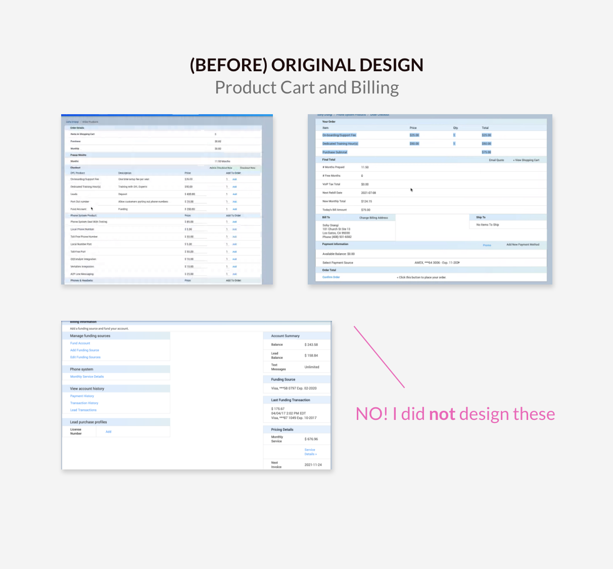
New Product + Billing Pages
Improved user flow, UX + UI design
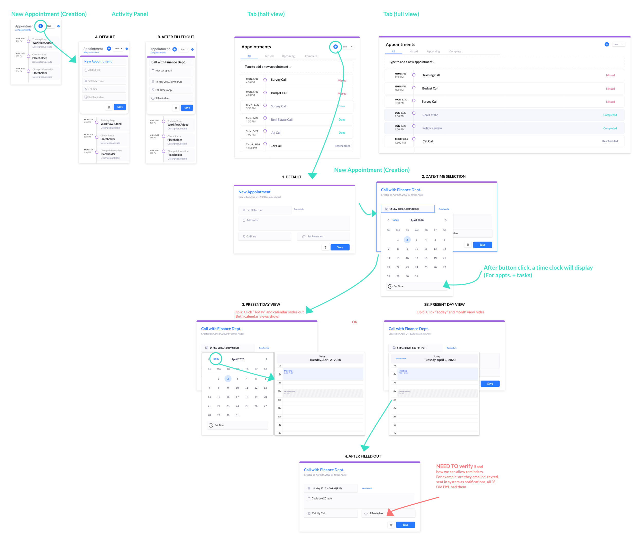
New Appointment Flow + Design
Timeline Design
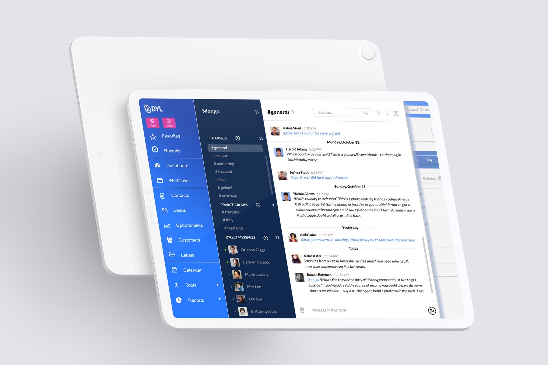
Final Views
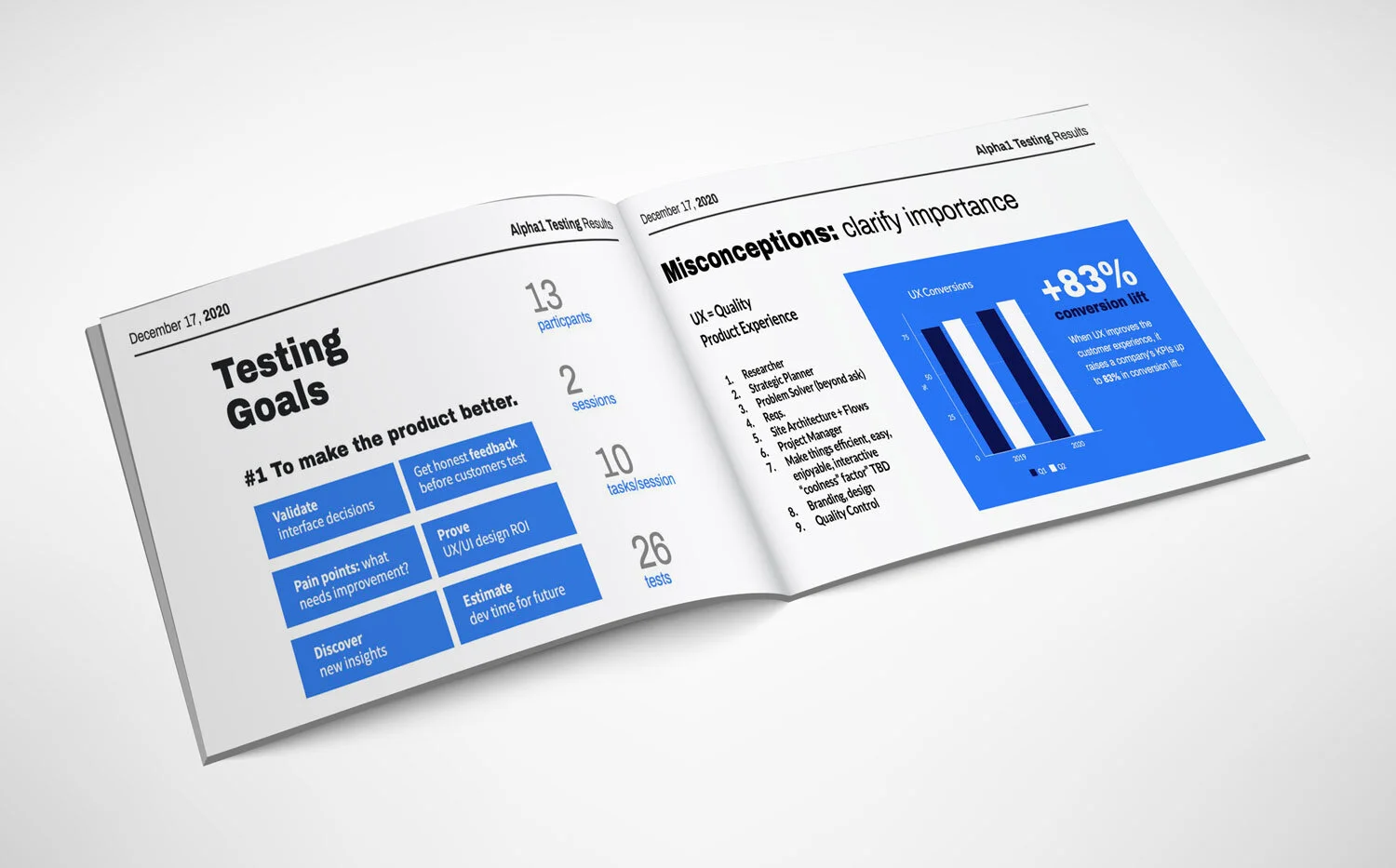
Usability Testing (Highlights)
I facilitated 3 moderated sessions and wrote out all the timed task and survey questions


